Wednesday 18 March 2015

OUIL502 - Corrine Cosmetics


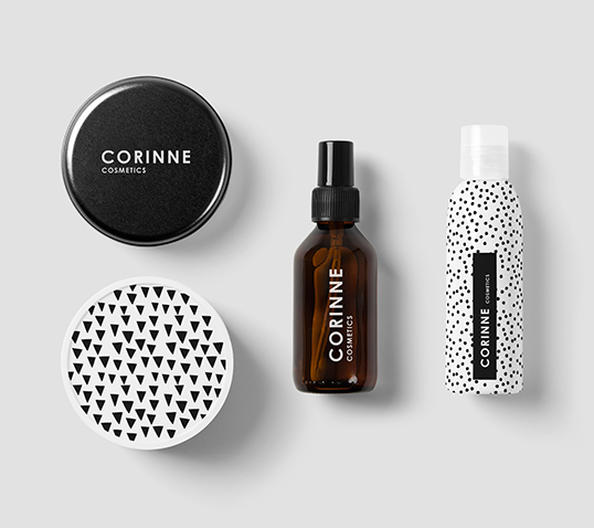
“Corinne is a lyric poet from Tanagra in Beotia, modern in appearance and perceptions, independent, liberal, social, deep thinking. She loved reading, occultism and astrology.
Corinne’s mission is to create the most effective and high quality skin care, hand and naturally made, products using the most efficacious active ingredients around the world. Our inspiration is the nature and its precious treasures, which combined with passion, love, knowledge and responsibility, create natural, effective and innovative beauty and wellness products.”

These products appealed to me because of their simple pattern design, which put the focus more on the brand name rather than any illustrative decoration. I think that how simple my designs are is something I need to think about carefully, because it gives off different vibes about the products.  

OUIL502 - Gazelli Cosmetics


Because we believe that beauty comes first from within, and because we love the cultural heritage of our country, we decided to craft the name of our brand from the word ‘Ghazel’.
Ghazel is a form of lyrical poetry that praises beauty, youth and love. These short poems speak of the untouchable, mysterious beauty of women, whose silk dresses and strands of rubies haunt the days and nights of men enraptured by love.
We illustrated our packaging with drawings conjuring up local tapestry and fabric patterns with scenes of rural life. We wish it to be an extension of hospitality in our poetic land of beauty.”

Even though the aesthetic of these products wasn't really what I was going for, I liked the story behind the design and that the name stood for what the products were trying to convey to customers. 


Tuesday 17 March 2015

OUIL502 - Studio Brief 1 - Mac Illustrated


MAC cosmetics released a new collection of Illustrated makeup bags in order to 'transform M·A·C makeup bags into mini-masterpieces' giving them more of a collectable factor. I think in order to expand my range and make it stand out more, I should design a product to go alongside the range that has more than one functional use.  
These products show how illustrations can be applied to a wide range of items, and can complete a set of products.


OUIL502 - Studio Brief 1 - Printed Peanut

The Printed Peanut produce illustrated, handmade soap in Yorkshire, I used this as inspiration for my 505 packaging. The texture of the illustration definitely reflects the production method, which gives the packaging a hand made feel, yet it still looks very professional. They also print onto other products such as badges and t-shirts. This is something I would like to do myself throughout summer and Level 6 by working harder on my online presence.

Monday 16 March 2015

OUIL502 - Studio Brief 1 - Aroma


“For this project the client asked me to create an affordable package where you could see, and smell the product. It also needed to be easy to package by hand and original.
In the small town in Mexico where I grew up, people would buy soap in bulk which was delivered wrapped in paper. I used this as inspiration and created a square, waxed paper wrapper. An oval die cut was added to allow the consumer to see and smell the product.”

I was thinking of taking this sort of approach with my packaging, and trying to focus on the logo of the brand, using that as a focal point, because I enjoy creating hand drawn type and logos. 


OUIL502 - Studio Brief 1 - Bakewell Soap Company


http://www.bakewellsoap.co.uk/

“This is a concept redesign of the soap packaging for The Bakewell Soap Company who produce, amongst other things, beautifully coloured blocks of handmade soap specially blended for different skin types. Sadly the existing packaging doesn’t live up to the quality of the product with a poor design and cheap printing.
The DZINE MAFIA packaging has brightened the pack giving a more solid brand feel, including a new simpler, more classic logo working alongside a slab-serif font in a handprinted finish. Bespoke illustrations sit top and bottom to help differentiate each variety, resulting in a gift or luxury treat with a more artisan and individual feel.”

I found this to be most relevant to my project, as they are quite unique scents, illustrated using a unifying style. These illustrations are quite life like, which is something I kind of want to move away from to make my designs a bit more unqiue, but I like the combination of texture and colour in these designs. 

OUIL502 - Studio Brief 1 - Spinster Sisters Co


“Inspired by vintage soap packaging, Spinster Sisters Co. approached me to design a unique, tactile box with a handcrafted feel that would allow the product to be seen, and the scent experienced. These small batch handmade soaps are produced with the finest natural ingredients. Rich with essential oils and botanicals, the products are gentle, sulfate free, pthalate free, and hypoallergenic.”
The boxes were deeply letterpress printed in one color on a heavyweight, rough uncoated stock. Boxes were die-cut and assembled, and color coded scent tags are easily added to the box front when the soaps are packaged.
The carbon footprint of the soap production facility is reduced significantly by a 3.3 kW solar photovoltaic system and passive solar construction. Every effort is used to ensure that the packaging will not end up clogging landfills by specifying recycled, recyclable or compostable packaging.”

Rather than using colour and pattern, this company focuses on text to create eye catching packaging. I really like the cut out to show the colour of the soap, I think this adds a more unique feel along with the ornate decorations. 

OUIL502 - Studio Brief - Ren Skincare


“Hart D’Lacey have designed REN Skincare’s 2014 Christmas Gift Packaging using vibrant illustrations of cranes, a symbol of longevity and good fortune throughout Asia.
Hart D’Lacey realised the symbolism of the Crane would provide a strong concept for this range of skincare Christmas gifts, representing happiness and good luck in the coming year for the gift recipient.
The imagery utilises REN’s established bold colour palette to give the gift boxes an increased prominence in a retail environment.

I think this packaging would be successful because of the bright, contrasting colour palette, easily standing out from the competition. I may use pops of bright colour to draw attention to my products, but I want to keep the overall palette quite calm.


OUIL502 - Studio Brief 3 - Creating patterns

For my creative CV pack I knew that I wanted to have a pigeon theme, seeing as that is my brand name, and I think my love for them is quite a unique aspect of my personality. 
I created these patterns that I could use as a background in each piece of the pack to unify theme and create a theme.


OUIL502 - Studio Brief 1 - William Dugan

For my mock children's book for COP, I began doing some research into the aesthetic of children's books. I knew what kind of style I wanted to work in, and found that William Dugan's work described that perfectly. The bold colours that work well together, give a retro feel to the images, and the block shapes have a mock paper collage feel to them.


Saturday 14 March 2015

OUIL502 - Instagram


My favourite social media platform at the moment is Instagram. I find it the easiest to keep updated, and I can mix between personal posts and illustration posts, which I think is good, because it makes you seem more human, rather than just a brand, which is how I want to be perceived. 
It's easier to get people to notice your work on Instagram, by using hashtags, and I find really useful to find inspiration and also follow my favourite illustrators.
All of my social media has the same username, Pigeonsaresick, because I want it to be as easy as possible for people to find me. I intend to also sign up to Twitter and start using that.

OUIL502 - Tumblr


I also use Tumblr occasionally, although again I don't find it as engaging as Instagram, I think mainly because it takes more effect to keep it updated regularly, and it's often hard to get noticed, although a few of my posts have had a fair few notes.
I want to improve my Tumblr over summer and push myself to be more recognised.
I think the main problem with Tumblr, is that there's a definite certain type of person that uses it, and certain things are more popular than other things, mainly pop culture related work, which I don't always like doing.

I also don't really like Tumblr, because it's full of a lot of irrelevant crap. I used to have a personal Tumblr, but I found it too distracting and I wasted a lot of time on it, so I deleted it and now only use my illustration Tumblr.

OUIL502 - Facebook


I set up my Facebook page a while ago, before we started the PPP module. I had a page during Level 4 but I didn't use it to it's full potential, got bored of it and ended up deleting it. 
I don't really like Facebook for promoting myself, as I find that it's hard to get the attention of people who you aren't already friends with, and you often have to pay to reach the followers you already have. 
However  I find it useful to have a place to display my work incase I need to direct anyone to my work. I also like the header feature in Facebook, which Instagram doesn't have, because it's bold and stands out.

Friday 13 March 2015

OUIL502 - T-Shirt designs

Recently I have been commissioned to create a few designs for band shirts and album covers.
I found working for someone else and trying to create something that we both liked quite challenging, but also rewarding by being able to visualise someone else's ideas. 


OUIL502 - Colours May Vary exhibition

After organising our own exhibition, I learnt a few things about my personal practice and working as a professional. I found that I can work well and efficient under high pressure when things need to get done, I want to be able to put more of this urgency into my everyday practice in order to get as much work done as possible. I think my prints were so well received because they stood out against the other prints with their bold colours.  


Wednesday 11 March 2015

OUIL502 - T-shirt design initial ideas

After I had created the initial design for the shirt I had been asked to do, I started trying to design text that would work well with the feel of the bands EP. I often find it hard to match text and image to a standard that I am happy with, so I ended up creating a few different variations.