Monday, 18 May 2015
OUIL502 - Studio Brief 3 - Final Promo Pack Outcome
Here is my final printed promo pack, including my business card, a pencil holder, a comic about myself and a zine of my work.
Overall I was very pleased with the outcome although there were some things I would have liked to change.
I think the paper quality looks nice, but the glossy finish gets damaged easily, and the corners have become quite scuffed, when I reprint these I will print onto matte paper instead to avoid this.
The comics themselves were okay, but I would have liked to have made them longer, and spent more time developing a narrative and making it funnier. I would have wanted to make a bigger emphasis on my interests and made a few zines of things that make me laugh.
I think my business cards are really well made and unique, however I didn't have time to give them a top coat, so they have got a little bit dirty and have a few marks on them.
The intend to create a series of children's books stemming from the pigeon character I created for the pack and may give these out along with it.
The intend to create a series of children's books stemming from the pigeon character I created for the pack and may give these out along with it.
Sunday, 17 May 2015
OUIL502 - Studio Brief 3 - Evaluation
I found this module to be the most helpful and I feel like I have improved massively since Level 4. Improving on my self promotion skills has made me a lot more confident with using social media, and has shown me how useful it is to create an online presence for myself. The Life's A Pitch brief helped me consider myself within a professional context and taught me to think about how I see myself working within the industry in the future. I had not done many presentations in the past that were as successful as Life's A Pitch, so I feel like I have definitely improved in that area. The feedback that my team received was very positive as our presentation was clear and straight to the point. I feel like I have learnt the elements of a good presentation and am a lot more confident in presenting to an audience. Looking back on my previous PPP presentation from Level 4 I can see how far I've come. I feel like I have a much clearer vision of what I want to become and where my interests lay; I'm a lot more confident in myself and my work and think that this module has helped me develop my self evaluation skills also. One of the most valuable aspects of this module was definitely creating the promotional packs. I had never considered how to promote myself as a creative person, I have written CV's before, but never thought about how different a creative CV would be.
I think the personal presence I have created for myself throughout this year has become very successful. My 'brand', I feel, is very unique and portrays my personality well. I can see a fluidity between the work I do for different modules as I become more confident in my interests and the paths that I want to take in regards to my practice. This has also spurred me on to branch out onto different websites to try and make some money from my work. Throughout the summer I intend to focus on building up a body of work on websites like Etsy to get myself more noticed.
The few commissions that I have done this year have been a definite strength, as I've learnt a lot from doing work for real people, rather than just following set briefs. Trying to please both myself and a client was difficult but also extremely rewarding, showing myself that someone would want to pay actual money for my services has given me a lot of confidence and made me excited for the future.
Blogging regularly could have been improved upon. I feel as though the massive amount of work we had for each different module made me put PPP to the back of my mind, seeing as the deadline was the last out of all of them. I wish that I had paid more attention to PPP at the beginning of the year, as I have really enjoyed it and feel as if I had spent more time on it, I would have gotten even more back. I found the PPP tasks of collecting different practitioners and blogging about them to be a bit forced, I find it hard to analyse illustration and put my thoughts down onto my blog. I have struggled with blogging from the start, and although I have improved, I still find it to be a laborious task.
During Level 6 I want to really push myself to go out of my comfort zone, I feel like this year my stubborness has held me back a little; I have always refused to work with photography and 3D illustration because I thought that I didn't have an interest in it, but creating my promotional pack and having to think about how to make my work unique and interesting, has made me see that I do infact have an interest in broadening my practice into new areas.
I am very excited about Level 6 and seeing how much I will progress through next year. I intend to blog more regularly and become much more organised by finding a way that really works for me. I want to explore more into 3D illustration and character and narrative by expanding my personal presence into a range of children's books. I know that I need to not slack off towards the end of a module, even if I get fed up of it, which tends to happen. I will set myself stricter deadlines in order to spur me on to get the work finished to a high standard. Focussing on the end product as well as development, I feel, will help me figure out how I like to work and the proccesses I most enjoy, I want to explore more printing techniques, as I feel like this will be a large portion of my practice when I leave university.
Saturday, 16 May 2015
OUIL505 - Studio Brief 3 - Final Promo Pack Images


I tried a more simplistic approach by just using this pigeon character, he made me laugh a lot and thought that it would create a connection with whoever was looking at it. However even though it was cute and funny, I didn't think it made as much of a visual impact as the other designs, so I decided to use an older design and add the pigeon character in, so I can make him a running theme within my promotional work.
I intend to make some childrens comics/books based on him throughout Level 6.
OUIL502 - Studio Brief 3 - Birdy Promo Pack

I tried something different from the simple line style that I'd been using in my other tests, and spent more time making detailed bird drawings. I thought that this would add a nice pop of colour against the pale background, but I didn't think the style that I was working with went well with the simple business card. I asked a few people and they said that the other designs reflected me much better.
OUIL502 - Studio Brief 3 - Promo Pack Comics
I was struggling to design the front of the comics and get it to go well with the aesthetic of the backing image, I decided I wanted to use pens rather than digitally as I feel it's easier to get the textures that I want.
I originally wanted to include the pigeon design on the front, but it looked too cluttered with the detailed background, so I decided to just use texture and hand drawn type.
OUIL502 - Studio Brief 3 - Business Card

After playing around with some designs in my sketchbook, I decided that I wanted to make my business card out of polymer clay, because the final design was just a simple shape, I thought it could be quite interesting to make it out of a different material, rather than just card.
Eleanor suggested that in the future I could try lazer cutting the business cards out of plastic or wood, which I would love to try, I just don't have the time at the moment.
I wanted to make an extra keep sake to put in my promo pack, after the tutorial with John I came up with the idea to make a pencil holder, that was a pigeons bum (because I like crude humour like that)
After hand in I intend to make better versions of these, because due to time restrictions, I cant at the moment.
Friday, 15 May 2015
OUIL502 - Studio Brief 3 - Promo Pack Mock Up

After making my business cards I started to mock up my promo pack, I came up with this idea and found that it worked straight away.
I wanted to create a tree scene so that it gave my business card a context, and I thought it looked quite cute and charming.
I had been thinking about how I would include everything in the pack that I wanted without making it too bulky. I came up with the idea of making two small comics, one called This Is Me, just explaining a bit about myself and one called I Did These, which would be a small zine of some of my other work. I want the narrative within the comics to be blunt and straight to the point, kind of like the humour in children's books.
Monday, 11 May 2015
OUIL502 - Studio Brief 1 - Paula Greif


Paula Greif's work is more about shape than complex detail, I would say, which works well with recognisable, bold shapes, like leaves and cats.
Saturday, 9 May 2015
OUIL502 - Studio Brief 1 - Andrew Ludick


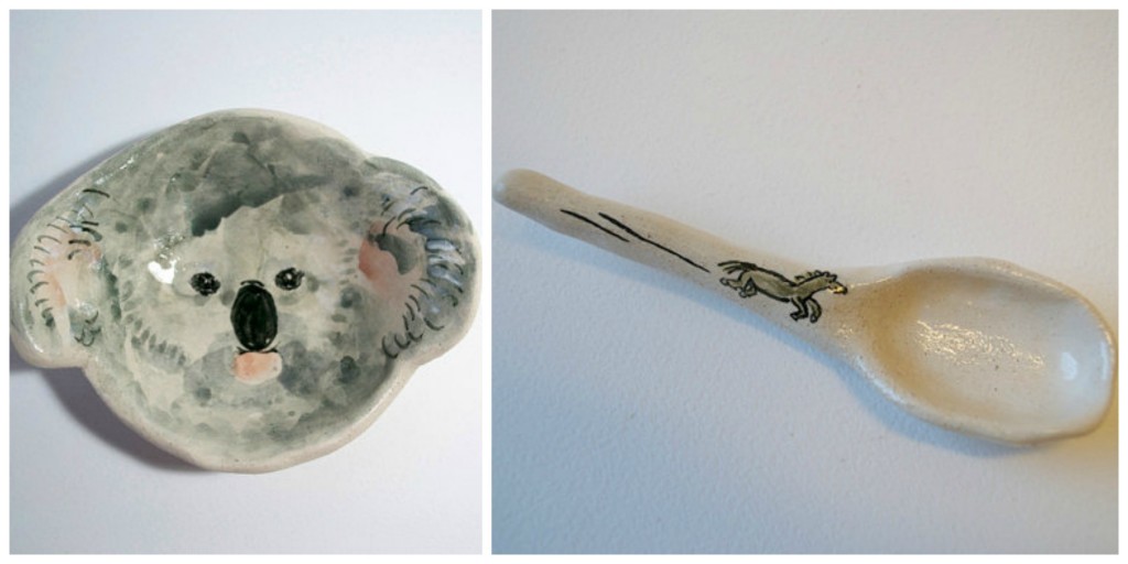
More ceramic illustration from Andrew Ludick. Obviously the jugs a way high above my skill level, but I could see myself making simple bowls and plates which I paint character or patterns onto. I think it would be successful combining my love of pattern making with my new found interest in ceramics.
Friday, 8 May 2015
OUIL502 - Studio Brief 1 - Charlotte Mei


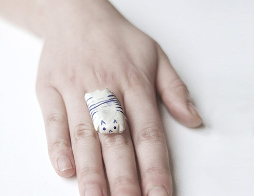
I think Charlotte Mei's ceramic work is possibly my favourite, especially the cat ring. They look pretty simple to make, and I think they also work with simple line detail. After some practice I'd like to branch out into more unique designs like rings and jewellery.
OUIL502 - Studio Brief 1 - Neiko Art


I find Neiko Art's work really charming and cute, she inspires me to create purely cute work and things that make me happy. I've had the idea for a while of doing pet portraits, and I can imagine doing them in this sort of neive style.
Thursday, 7 May 2015
OUL502 - Studio Brief 1 - Makoto Kagoshima


Some simpler designs, again featuring animals, this seems to be popular in the ceramic art world. Makoto's work is different from the other artist's I have looked at, as he uses much duller colour schemes, which I like.
OUIL502 - Studio Brief 1 - Laura Carlin


I am in love with wonky shaped animal pottery, I have discovered, I find them irresistibly cute. I think this would work really well with my Pigeon brand and it's something I want to look into more next year. I like the way Laura Carlin incorporates pattern and ceramics, and they are both beautiful to look at and functional.
OUIL502 - Studio Brief 1 - Julie Van Wezemael


I found Julie Van Wezemael's work on pinterest when I was looking for illustrated ceramics while making my business cards. I've realised that I want to start expanding my practice into the 3D market, I think this will really benefit me, especially now I'm looking more into children's book illustration, because as I start looking more into character design, I can transfer my characters across different platforms to expand the range.
Wednesday, 6 May 2015
OUIL502 - Studio Brief 3 - Business Card Development
I continued doing some sketches and developing my business card, I found that the designs that worked best were the more simple ones, they had a bigger impact and could also work at different sizes. I wanted to come up with a seperate little logo that also tied in with my business cards, so that I wouldn't have to write my name all the time to be recognised. I intend to take the final design and put it onto clay, as I think this quite unique and will stand out.
Tuesday, 5 May 2015
OUIL502 - Offlife Comic

I submitted this comic for the Offlife website for the Responsive module. I really enjoyed writing this, as I like doing humorous work and I got a lot of good feedback on it, although I wasn't very pleased with the style of the illustration, I'm not used to combining narrative and image, this was the first proper comic I had done in a long time and I think I need to practice more so I'm happy with all aspects of it.
Monday, 4 May 2015
OUIL502 - Studio Brief 3 - Business card ideas
I had already made some business cards to use at Thought Bubble convention and our exhibiton at Colours May Vary, but I wanted to make some new ones that went better with my pack. I started sketching out some ideas and playing around with using cut out shapes of birds, as I know I want my pack to be pigeon themed.
OUIL502 - Studio Brief 3 - Promotion Pack sketches
I felt a bit stuck at first with my promotional pack and what exactly to put in it.
I knew that I wanted to theme my pack around pigeons because that's what I call myself, Pigeonsaresick, but I didn't know what I wanted the aesthetic to be.
I started writing some ideas down for a comic I would include and decided that I want to turn it into an illustrated poem.
Subscribe to:
Comments (Atom)