Monday 30 December 2013

OUIL402 - Studio Brief 1 - Ashley Percival - Colour and detail


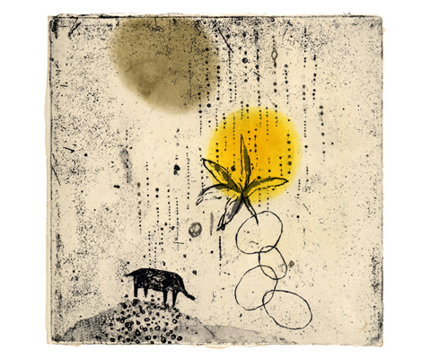
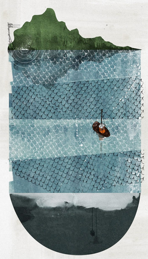
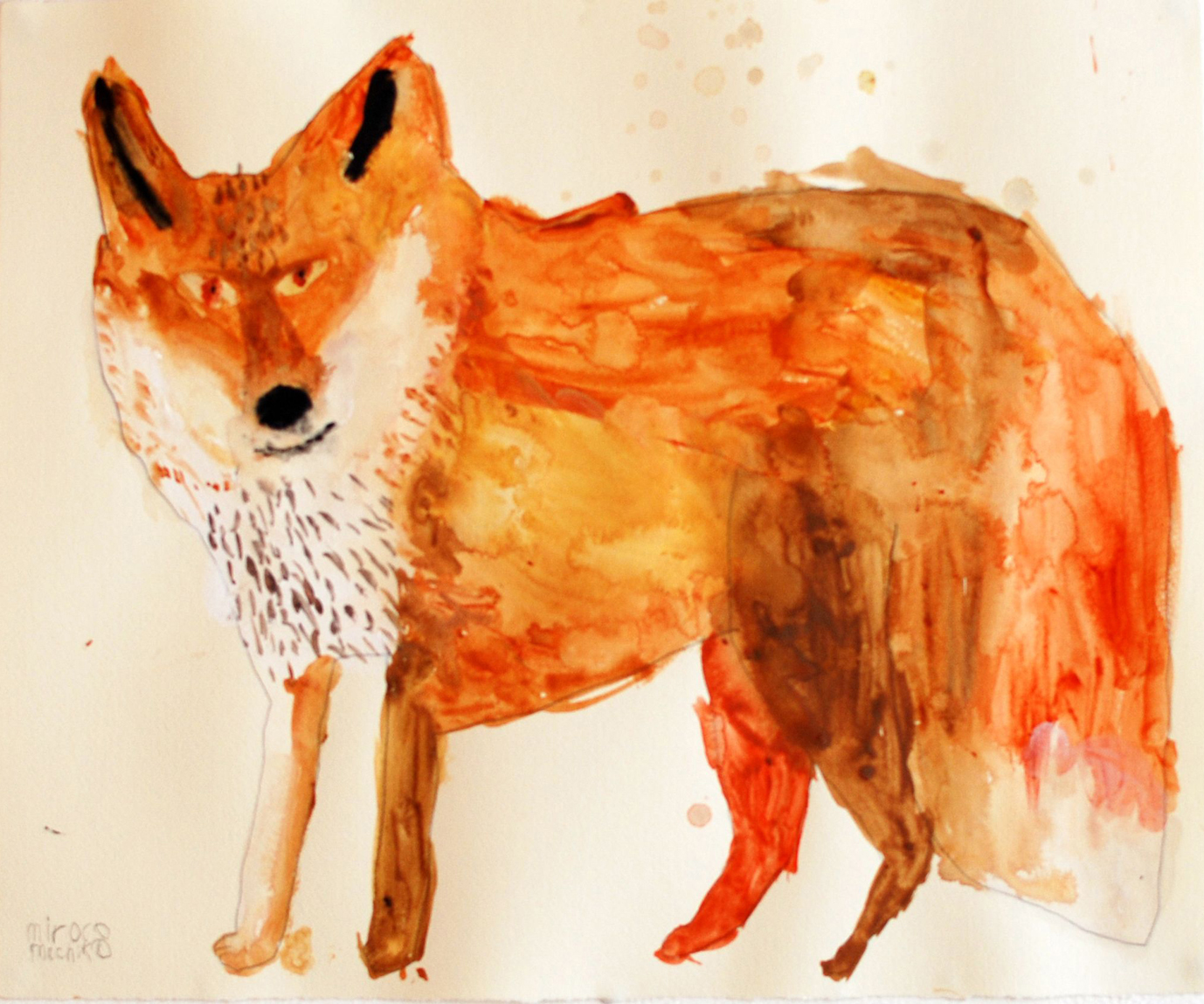
Ashley Percival uses kind of a collage effect to personify the characters in her work, each piece of the work looks like it has been places together in order to communicate something, how the jumpers and clothes look seperate to the characters actual head, and how the they are drawn in a different way, the clothes rely a lot more on texture where as the characters head are a lot more detailed. There is a lot of minute detail especially in the fur on the animals, which used small neat marks to create texture, even though the lines are quite messy they are still controlled to create neat blocks of colour and texture.


OUIL402 - Studio Brief 1 - Nick Iluzada - Colour


Instead of using a lot of line, Nick Iluzada uses blocks of colour without an outline and overlapping tones to create texture and depth, this gives it a very hand drawn quality even though it is clearly digital. The colour palette is also quite limited, and uses pops of small areas of a unique colour to create a focal point, which can be seen in the bottom image with the woman's hair. Nick creates a frame within his work and movement in his shapes to also create line of sight and move your gaze up and around the image to try and create a narrative or suggest a story.


OUIL402 - Studio Brief 1 - Kumi Obata - Line quality


Kumi Obata's work looks quite naive in the way that it represents real objects, for example the houses, birds and trees. Although they look nothing like how they are in real life, we still know exactly what it is meant to communicate because he has picked to show the most important and memorable aspects of that certain object. He uses lots of texture and a kind of collage effect, with strong gestural lines. In the top image it looks like he has used some sort of etching technique to create this, which was possibly printed with monochrome on top of an existing colour print.

OUIL402 - Studio Brief 1 - Rich Gemmell - Format and texture


The unusual formats that Rich Gemmell uses in his work helps to communicate a narrative behind the image, he plays with viewpoint and perspective to create surreal looking landscapes. He also layers texture to create a sense of depth and to give his work a hand made quality. I love the unique qualities of Rich's work, I think that using different formats like this would really benefit my work and make it much more diverse. As well as blocks if colour he layers lines on top of these textures and colour.

OUIL402 - Studio Brief 1 - Miroco Machiko - Shape and texture


I love the way that Machiko's work looks like a child's drawing with the way that the shapes of the objects in the work are imagined and are quite sloppily made. The textures created from whatever medium was used again communicates this style along with that the imagery appears quite naive to what the real life object actually looks like, yet we can still recognise what it is meant to represent. He uses large and messy brush strokes to create blocks of colour, yet he still considers composition within his frame.


OUIL402 - Studio Brief 1 - Roger Duvoisin - Texture


I really like the textures in Duvoisin's work, it reminds me of old penguin books with the way the colours look quite muted and mucky, and the shapes in the work kind of blend together to give a hint at the media used to create the lines. Especially in the bottom left image you can see the lines all go in the same direction to create movement and line of sight to draw the viewers eyes up to the focal point of the image and to give a sense of the narrative. Similar to other artists I have looked at, Roger uses layers in his work, placing line work on top of block images to combine both line and shape.


OUIL402 - Studio Brief 1 - Laurent Moreau - Colour


Laurent uses bold and bright blocks of colours, and not much tonal value to create quite flat images, He uses very basic shapes, lines and mark to create simple and bold images. He again uses quite a limited colour palette of mostly primary colours to create focal points in his work. I think that format and frame is very much considered within his work, especially when using negative space to highlight something.


OUIL402 - Studio Brief 1 - Melissa Castrillon - Line quality


Melissa Carlton uses lots of small and uneven marks to create large spaces of colour, it reminds me of children's colouring, which I like. The line quality looks quite messy in a deliberate way which communicates a hand drawn feeling to her work, combines with the subtle and muted colour palette. He work looks quite unfinished and sketchy and she plays around with perspective. The top image looks like it was drawn very quickly and possible drawn from life.


OUIL402 - Studio Brief 1 - Piu Sudo


I think that Piu Sudo's work is really cute, I love how she uses small and simple shapes to create the animals and kind of personifies them, giving them personality. I also like how she layers up block colours with thin, delicate lines on top to add subtle detail. 


OUIL402 - Studio Brief 1 - Isabelle Arsenault - Colour


I love Isabelle Arsenault's washed out and gentle colour palette that she applies in her work. I think it goes well with her cute style and compliments it. It adds a fantasy tone to the work, which again goes with the context of the work, which is for childrens story books.


OUIL402 - Studio Brief 1 - Karolin Schnoor - Format and colour


I think it is quite unique and effective how Karolin uses a white outline or space in her work rather than a bold black one, I think it goes well with the soft and fluent tone the work is trying to communicate. I also think she again thinks a lot about where she places every element of her work, and it kind of creates its own frame with the shape of the illustrations themselves. Again her work has a lack of line but uses shapes instead to suggest line and texture


OUIL402 - Studio Brief 1 - Tetsuo Aoki - Shape and texture


There are many aspects of Tetsuo Aoki's work that I love, the way he uses simple texture alongside shape to create weird and exaggerated figures, and also the way he has obviously considered the layout of his work, where to place each figure and how much white space to leave to create maximum impact.


OUIL402 - Studio Brief 1 - Maja Sten - Line quality


I really like how Maja Sten combines realism and surrealism in her work, both with the imagery she portrays and also the shape and style of her work. She uses a lot of texture to create interesting patterns in her work yet also tries to keep some form of reality in it. Her work also has depth, with the way you can clearly tell what is supposed to be the foreground and what is the background.


OUIL402 - Studio Brief 1 - Katie Scott - Format and line making


I like Katie Scotts work because it is simple and true to life, even though she doesn't use crazy shapes or textures her work is very delicate and crafted well in order to create good looking realistic illustrations. It looks like she has considered every aspect of her work in the bottom piece as everything is laid out to compliment itself and give everything an equal amount of focus.


OUIL402 - Studio Brief 1 - Laura Bifano - Colour and texture


I like Laura Bifanos work and the combination of texture and colour that she uses to suggest real life textures which combines with her style of work. I especially like the soft colour palette she uses in the top piece of work and her use of lighting to create the appearance of shadow and depth.

OUIL402 - Studio Brief 1 - Megan Brain - Shape and collage


I like Megan Brain's work because the components of it are simple but they come together to create something that is intricate and highly detailed. Althought this work is 3D I think the technique itself can be used to create a 2D piece of illustartion, layering up and collaging flat shapes with flat colours I think creates very interesting pieces of work. His work has made me much more interested in 3D illustration, rather than focusing on the photography aspect of 3D illustration focusing on the actual quality of the work and how you create it.


OUIL402 - Studio Brief 1 - Till Hafenbrak - Shape and colour


Till Hafenbraks work reminds me of a really complicated screenprint, how she uses block shapes of colour and overlaps them to create new colours. The shapes she uses also remind me of infographics, how there are a lot of straight lines and few curves and the shapes are very angular, they suggest the shape of a real object rather than copy it directly.


OUIL402 - Studio Brief 1 - Brendan Wenzel - Collage and texture

I looooooove the way that Brendan Wenzel combines shape with texture to create these cute birds and animals. The bold shapes and texture used to create high amounts of detail work really well. The different segments of each illustration look like they have been layered on top of each other like a collage technique.

OUIL402 - Studio Brief 1 - Tim Lahan - Type, colour and format


I like the way Tim Lahan uses simple and bold shapes combined with a bright colour palette to create a simple yet effective way of communication. I think the way he uses format but breaks through it in the comic panels above creates an interesting visual. I think the sleek and handwritten style of type he uses in his work goes well with his style as it is not over complicated.


Saturday 28 December 2013

OUIL402 - Studio Brief 1 - Lizzy Stewart - Line quality


I love the way that Lizzy Stewart represents real life objects in her work through mark making and textures, I think this is more effective than drawing things exactly how they are meant to be, rather just suggesting the shape of look of an object that still communicates what it is but creates a more fluid and interesting aesthetic, I think the media that she chooses to use works very well with this style of drawing, especially the way she uses ink to create unique and different line qualities each time. She layers line on top of shape to add subtle detail to her work without making it look too busy and messy, I again think this works well alongside the other techniques she employs to create a unique and recognisable style.


OUIL402 - Studio Brief 1 - Donya Todd - Shape and colour

The thing I like most about Donya Todds work is the line quality, the tool that she uses creates a unique outline which has a very hand drawn quality to it as it is not all neat and uniform. She again uses colours in a similar way to the last two illustrators I wrote about, although all the colours are generally flat she uses them to create texture to make the image more visually interesting.
I would put Todds work in the shape and colour categories.


Friday 27 December 2013

OUIL402 - Studio Brief 1 - Kyle Platts - Shape and colour


Similar to Ryan Heshka's work, I think the colours that Kyle Platts uses very much compliments the tone of voice he is trying to put across in his work, unlike Heshka who uses soft pastel colours that compliment each other, Platts uses quite vibrant pastel colours which contrast each other.
Platts work has helped to inspire my work for the Visual Narratives brief, specifically his work in Megaskull. Each comic shows an exaggerated social commentary which he does very well, using the colour scheme to help the exaggeration. 
To me Kyle Platts work would come under the category of both line making and colour. 

OUIL402 - Studio Brief 1 - Ryan Heska - Colour


I was inspired by Ryan Heshka's vintage style illustrations and the colours that he uses. Each image has a limited colour palette using mainly pastel washed out colours, giving it kind of a grainy/hazy feel. I want to try and incorporate similar colour schemes in my work as I think it adds a certain fantasy element to drawings of real life things and makes them more interesting.
I also like how Heska works in irregular formats, for example the squares with rounded corners above, which add to the 'vintage' look and tone of voice his is trying to create.
I think that Heshkas work would fit under the catergory of Colour

Sunday 15 December 2013

OUIL402 - Studio Brief 1 - YOLO

http://www.youtube.com/watch?v=LkKKTsJZ5kU&oref=http%3A%2F%2Fwww.youtube.com%2Fwatch%3Fv%3DLkKKTsJZ5kU&has_verified=1

This animation by Michael Cusack parodies the recent trend in youth culture 'Yolo' or you only live once.


Focussing on two girls going out and getting as pissed as possible, it picks up on the need for people (usually females) needing to look good and spending too much time worrying about their appearance.


They then go on to take and upload 5 billion photos which breaks the internet. This is obviously taking the piss out of girls who upload too many needless photos of themselves to Facebook. I think this relates directly my project and I can use it to help me focus on which aspects of youth culture I want to parody and exaggerate. 

Monday 18 November 2013

OUIL402 - End of Module Self Evaluation


  • Throughout this module I have developed many new skills and also improved many, I think my development skills have improved massively and I now find it more useful and beneficial to my work to put down all of my ideas and focus on getting them down rather than the quality of them. I think that I best applied my development skills in Brief 4 as I kept on testing backgrounds and ways of creating texture in order to best communicate my quote. I think that my time management skills are also improving, as I am finding it easier to balance my time equally between the different aspects of the course.
  • I now like to focus a lot more on creating texture in an image and letting that shape my final piece. During the concept development for the Initials Brief I found that experimenting with creating different textures was very important in developing my ideas, because often the textures that I created would then lead on to me coming up with or expanding on a new idea. I found that putting down loads of mini concept ideas onto a sheet was a very effective way of coming up with enough ideas, I intend to employ this method of development more in later briefs.
  • I think that the way I can easily change the way I work and create images to fit to a certain brief is a strength of mine, I don't think that I am bound by a certain 'style' and can create different types of images using different types of media and I'm not afraid to experiment or go out of my comfort zone. I think my work has become stronger since I started experimenting more with shape and texture.
  • I think that because I have found a media that I like to work with, I sometimes tend to begin working with this straight away and carry on using it because I know that I can get good results with it. I intend to start using collage more as it is something I haven't experimented much with. Also I sometimes tend to get stuck onto one idea that I think works for the brief and not want to try to create more or stop developing it, for example in Brief 4 I found almost straight away the idea that I wanted to use as I couldn't think of any other ideas that I thought would fit with the brief. 
  • During the next briefs I intend to experiment more with collage as I think this would give me a lot of different results that I have not had before. I am also going to try and step away from an idea even if I am happy with it and think it describes the brief, as I may end up coming up with something better if I carry on generating ideas. Throughout our next brief I intend to focus more on development rather than the final outcome, I think I focussed too much on the quality of the final pieces for the previous briefs. I also need to spread my time even more equally between visual language and the briefs that we are given, as I found that I tend to prioritise too much and often leave one thing until the last minute. Finally I think that I need to focus more on ongoing evaluation during a brief, I do this mentally but I think I need to improve this by putting more of it on my blog.

Thursday 31 October 2013

OUIL402 - Study Task 3 - What is illustration? Part 2

Narrative 

Adrian Tomine - panels from Shortcomings.
Adrian Tomine's graphic novels are narrative based illustration.


Craig Thompson - page from Blankets.


Ana Albero -  comic-strip for issue #112 of the Swiss comic magazine Strapazin


Kyle Platts - Megaskull


Luke Pearson

Communication


Donough O'Malley - for The New Internationalist


Donough O'Malley - for PC-Pro Magazine


David Peter Kerr - for The New Internationalist


WW1 Propaganda Poster


Rosie the Riveter 

Personal


Blu's sketchbook work


A.J. Purdy


Educational

Kena Reval

Mark Watkinson

Commercial